Amidst the px, em, percent, and so much more units made available with CSS, confusions on the perfect units for dimensioning your HTML elements could arise. Using a unit that seems to work at first glance might trick you into believing that all is well. Sometimes, our choice of units when styling could backfire when our webpage is viewed on another screen. Situations like this make us fall back to media queries to save the day, because why not? How would I expect one CSS dimension to fit several viewports? With a better understanding of CSS Units, one size could fit all viewports.
Having worked with CSS for a really long time, I have formed various rules of thumb while working with CSS units and recycled them along the way to streamline my styling process. I believe some of these rules could help you very much as they did me.
Rule 1: Use relative units instead of absolute units as much as possible
CSS length dimensions can be represented in two units; the relative and absolute units. The major difference between them is that the absolute unit remains the same size on different screen types and viewports. The relative unit, on the other hand, has a size relative to some set constraints — these constraints could be the parent element font size or the current viewport size.
Relative units are preferable as they could help to properly size elements and fonts relative to your screen’s viewport and your HTML root element. If implemented carefully, it could drastically reduce time spent styling the same elements using media queries. A good place to start is replacing px for rem on your element’s widths, heights, font sizes and more.
Some examples of absolute units are cm, mm, px, pt, and a few examples of relative units are em, rem, vw, vh.
Rule 2: Do not neglect the “max-” and “min-” properties.
As often as you use the width and height CSS properties, try to visualise edge cases where the viewport is larger or smaller than it actually is — this would help you to determine whether a min-width, max-width, min-height or max-height property would be useful in such scenario.
The “max-” and “min-” properties could be a total lifesaver in the weirdest screen dimensions.
Rule 3: Margin is not Padding, and Padding is not Margin.
In my early days as a Software Engineer, it took me a while to see the difference between padding and margin — for me, all that mattered was that they both created spacing for my HTML element. After using them repeatedly, I noticed that even though they both created spacing, they were not similar.
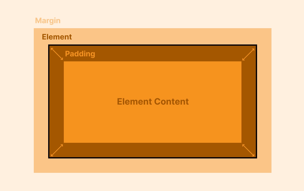
Padding is simply the inner spacing in the element, and a margin is the outer spacing. Knowing when and when not to use both CSS properties would help you build better and avoid dimension problems on other viewports.
Rule 4: There is always a root cause; adding and subtracting dimensions is never a long-lasting solution.
If you have ever tried to center a div manually by adding and subtracting margin and padding dimensions, this is especially for you. Oftentimes, when we try to fix code to meet a design requirement or guideline, we tend to modify the dimensions hoping it just matches what we have visualized; we could try to add a negative margin or reduce the element’s padding just to achieve that mental picture. But the truth is, taking this approach works sometimes, but other times, it could be chaotic — so why not take the safer approach?
The safer approach is the one that feels less manual and more automatic; you could explore using an auto margin; if that doesn’t suit your needs, use the flexbox; if CSS’s flex doesn’t quite cut it, CSS grids might just save the day — either way, make sure your solution does not require a lot of manual effort when it is displayed on varying viewports.
If you read this far, thank you! Feel free to drop comments and questions if you have any — criticisms are greatly appreciated too, as I have only just begun my journey in Technical Writing.